
What is the Difference Between Payne's Grey and Jane's Grey?
The Art of Grey: Understanding Payne's Grey vs Jane's Grey
When it comes to grey watercolours, two names often spark debate amongst artists: Payne's Grey and Jane's Grey. While both offer beautiful neutral tones, understanding their unique characteristics can transform your painting approach and help you make informed choices for your palette.
What Makes Each Grey Special?
The fundamental difference between these two greys lies in their pigment composition, which dramatically affects their behaviour on paper and mixing potential.
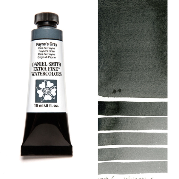
Payne's Grey: The Traditional Choice
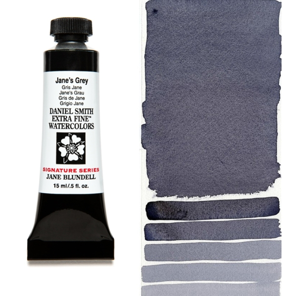
Jane's Grey: The Modern Innovation
Practical Applications
When to Choose Payne's Grey:
- Creating dramatic, moody atmospheres
- Painting stormy skies or shadowy areas
- Mixing vibrant greens for landscapes
- Working with a limited palette where one grey needs to do multiple jobs
When to Choose Jane's Grey:
- Achieving natural, luminous shadows
- Creating subtle colour variations
- Working with subjects requiring warmer neutrals
- Maintaining colour harmony across your painting

The Verdict
Neither grey is superior; they simply serve different purposes. Payne's Grey offers traditional reliability with its bold, cooler character, while Jane's Grey provides modern versatility with its warmer, more mixable nature.
Many artists find value in having both colours in their palette, using Payne's Grey for dramatic effects and Jane's Grey for subtle, natural tones. The choice ultimately depends on your artistic style, subject matter, and personal preference.
Whether you're painting misty morning landscapes or intimate still life studies, understanding these differences will help you select the perfect grey for your artistic vision. Visit Art Shed Brisbane to explore both options and discover which grey speaks to your creative spirit.