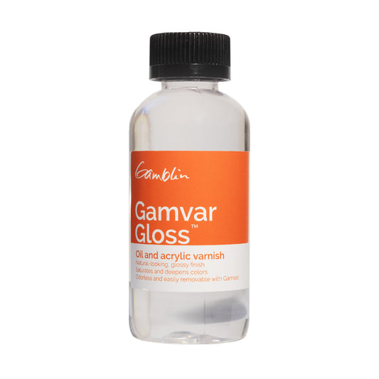
Why Do Gamblin’s Products Look Different?
If you’ve noticed your Gamblin paint tubes or mediums looking a little different lately, you’re not alone! Gamblin has introduced fresh branding for their artist-grade oil paints, mediums, and more. These updates are designed to improve your experience as an artist while staying true to their commitment to quality and sustainability.
Here’s what you can expect from Gamblin’s new look:
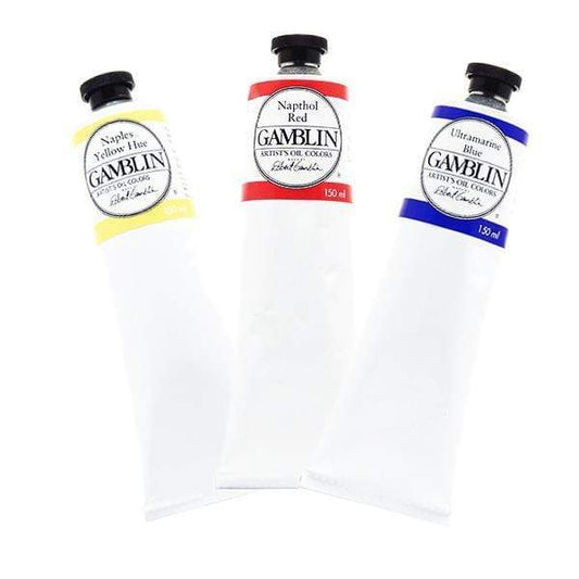
- Larger, easier-to-read fonts for effortless identification.
- Bold, clear pigment numbers for precise colour selection.
- Tri-lingual colour names on all sizes, increasing accessibility for artists around the globe.
- Transparency indicators and series numbers prominently displayed on the front of the tube.
- QR tags linking directly to official colour information and inspiration tailored to each colour.
- Natural oil icons (flax and safflower) highlighted to showcase their sustainable materials.
Gamblin’s goal with this rebrand is to better reflect who they are as a colourhouse, support artists and retail partners, and continue moving painting forward. Their promise? To always seek better ways to serve the art community while maintaining the exceptional quality you know and love.
A Few Notes for Artists:
- The rebranding is rolling out gradually, so you might still see some older labels for now.
- Not all colours and mediums have arrived yet, so don’t worry if your favourite products look different from each other.
- Our website updates to reflect these changes are in progress and will be live soon.
We’re excited for you to explore Gamblin’s refreshed design and the added convenience of their new labels. Whether you’re stocking up on old favourites or trying something new, the enhancements are sure to elevate your studio experience!